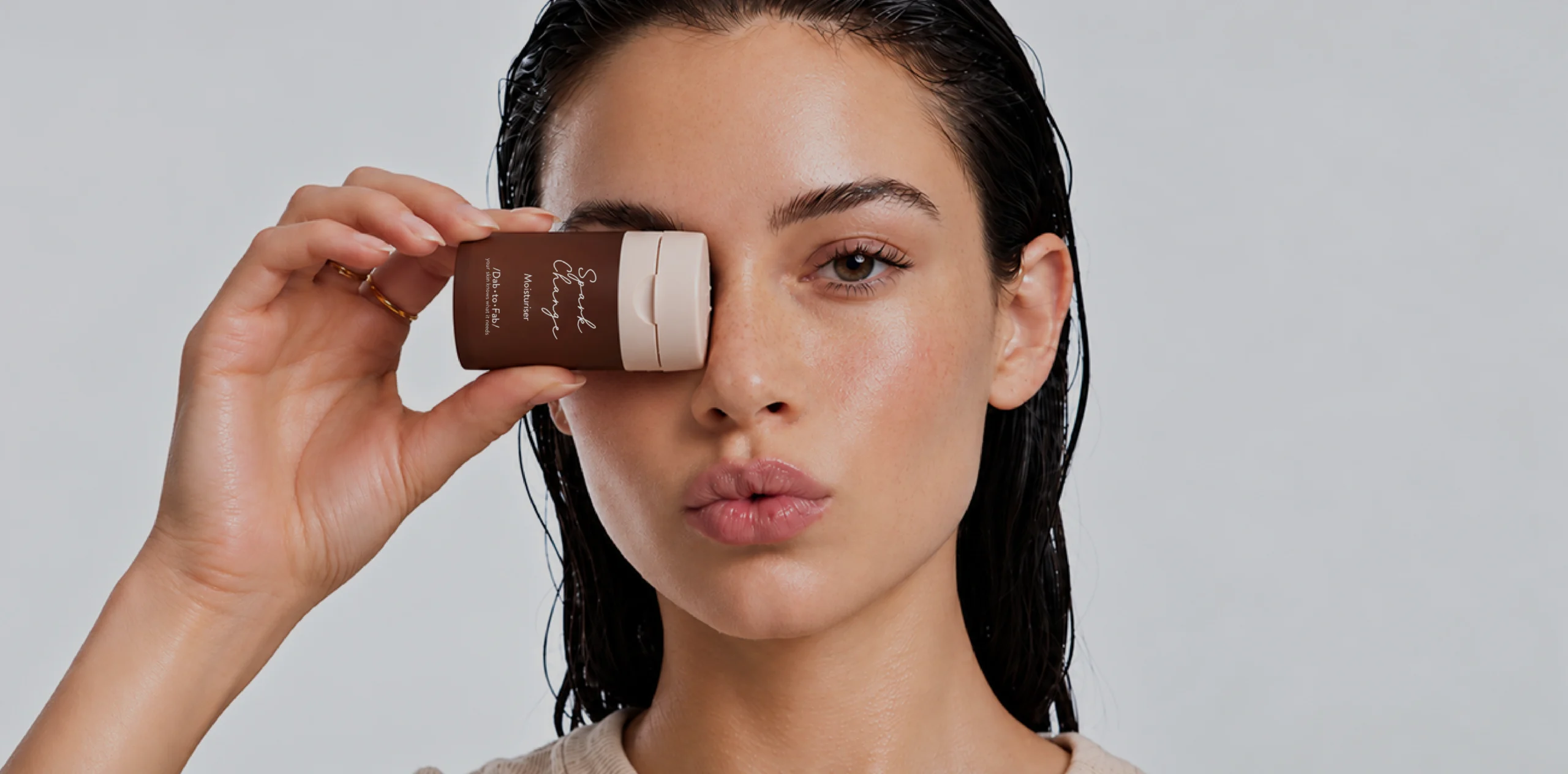
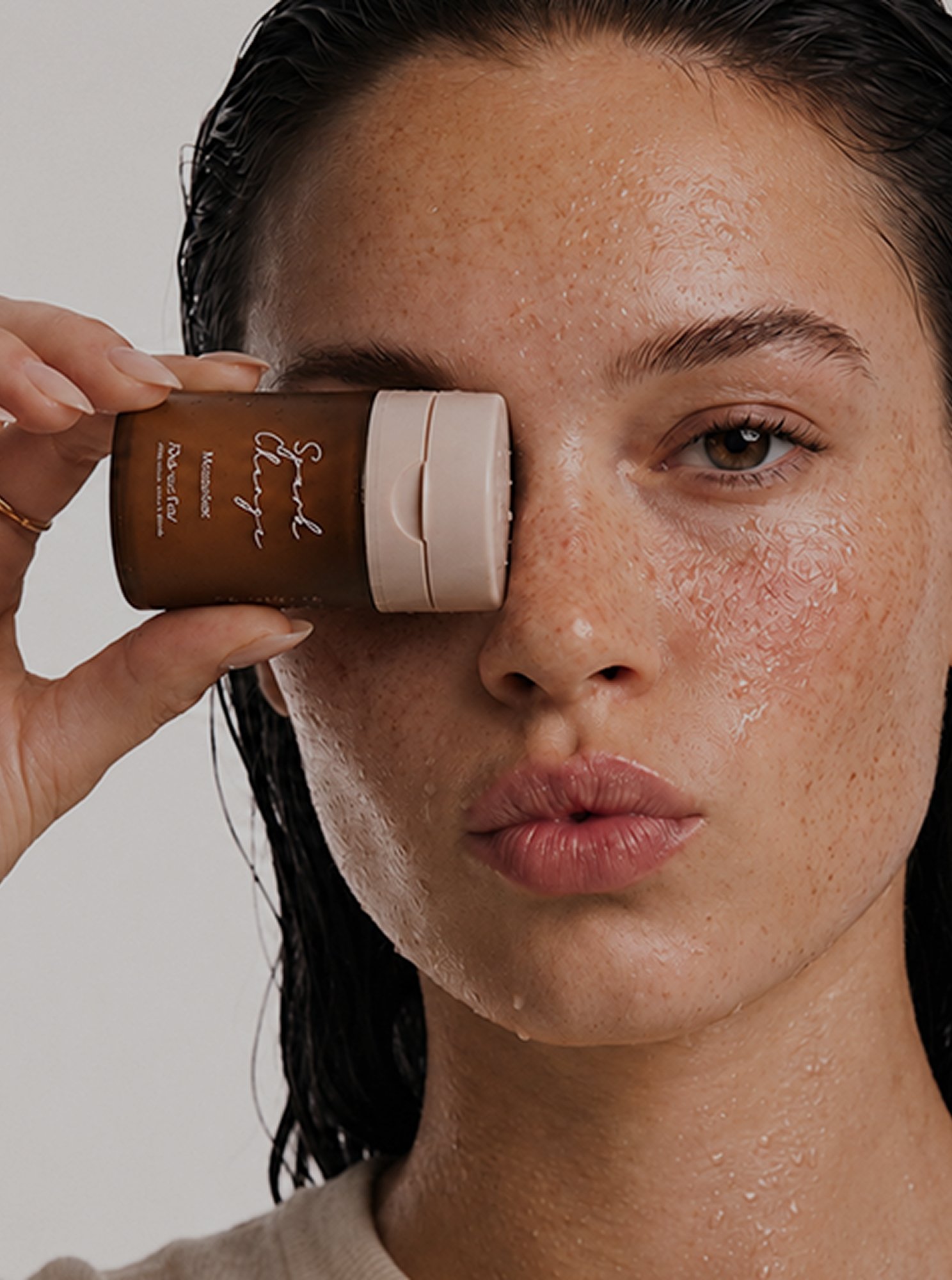
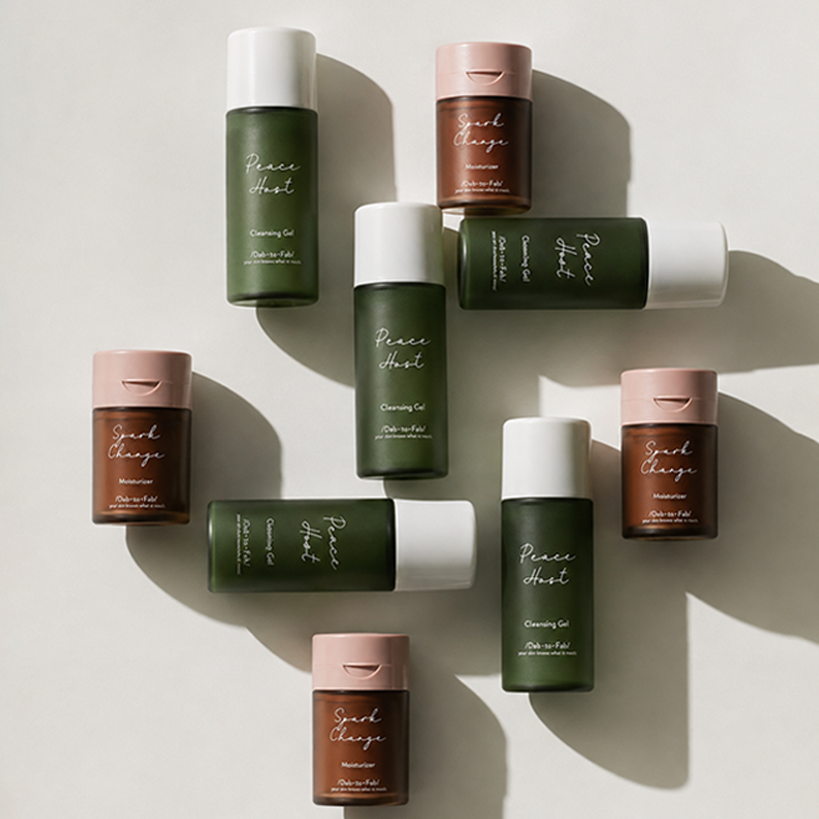
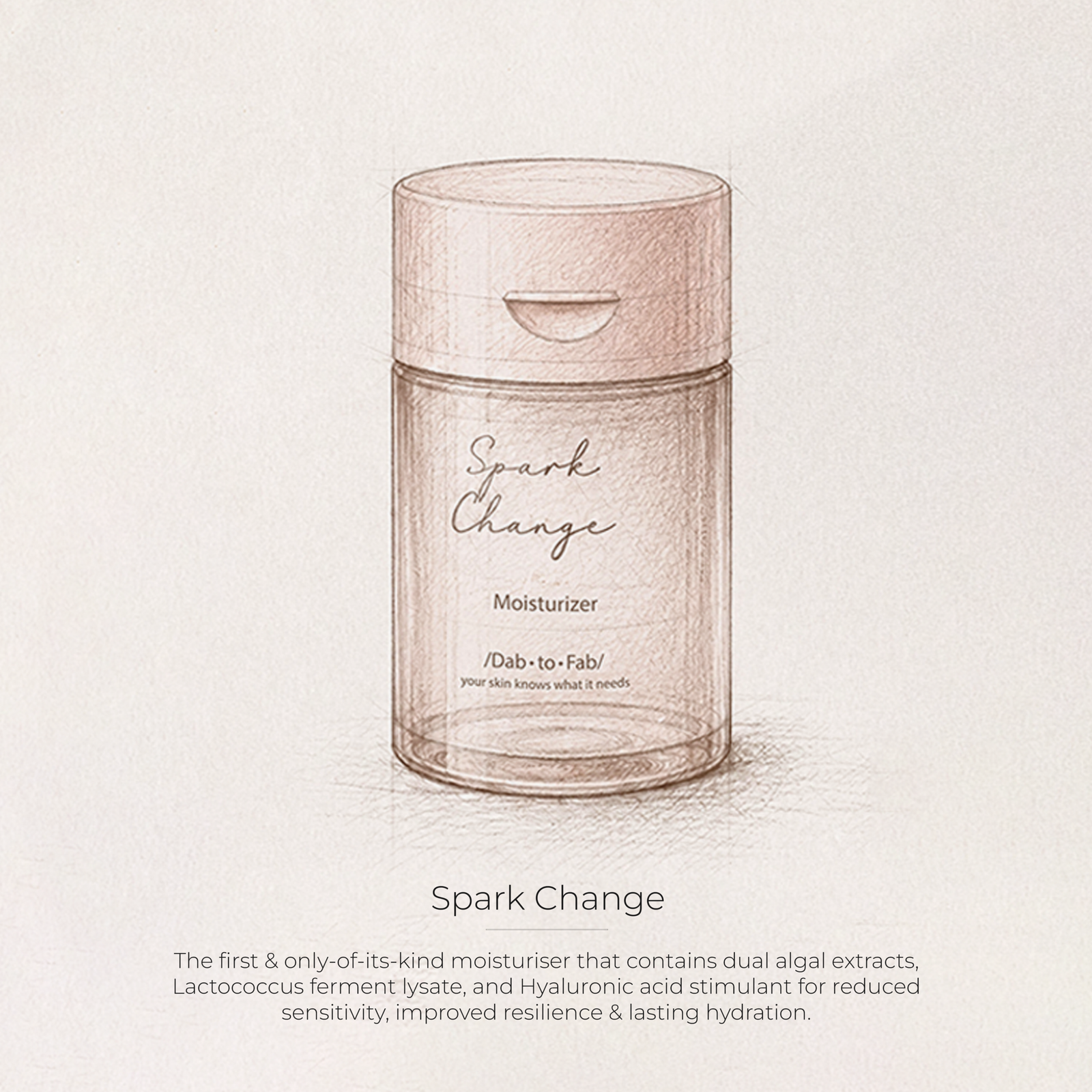
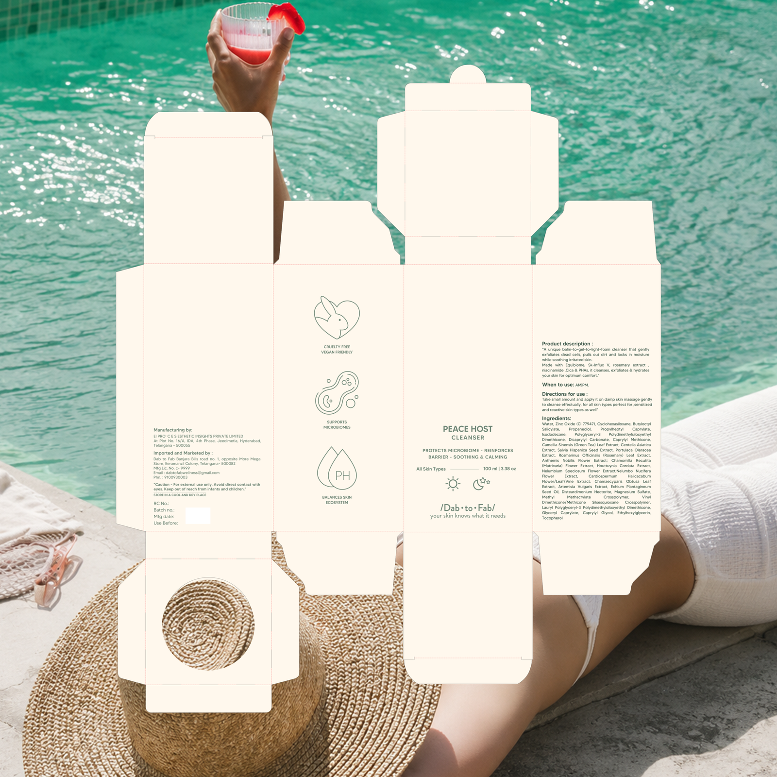
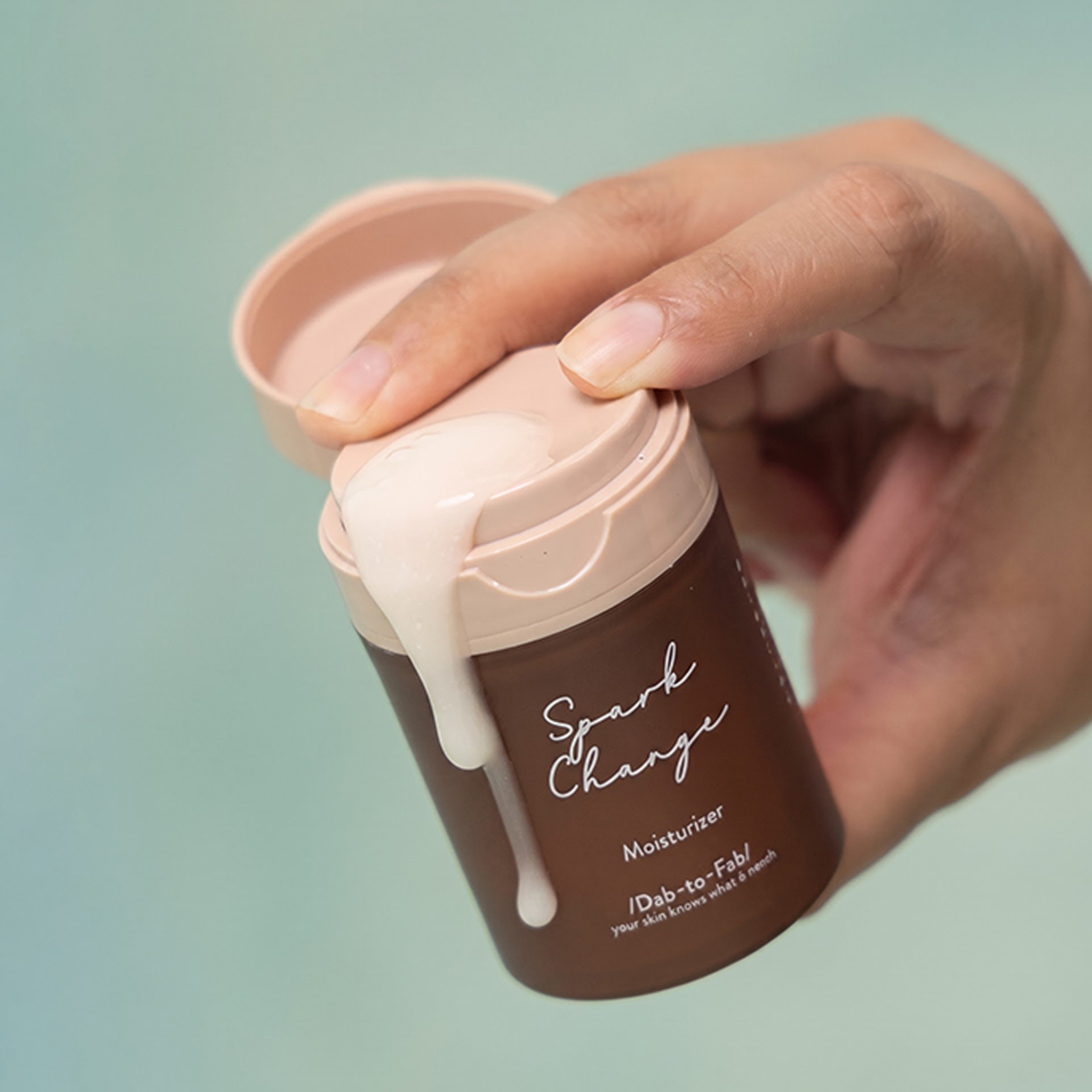
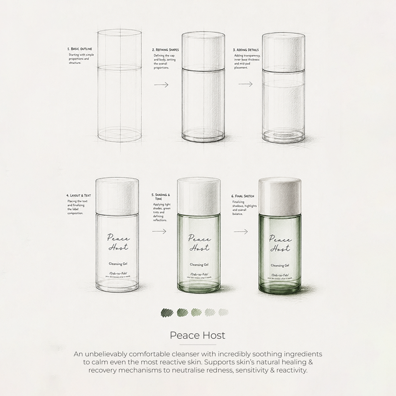
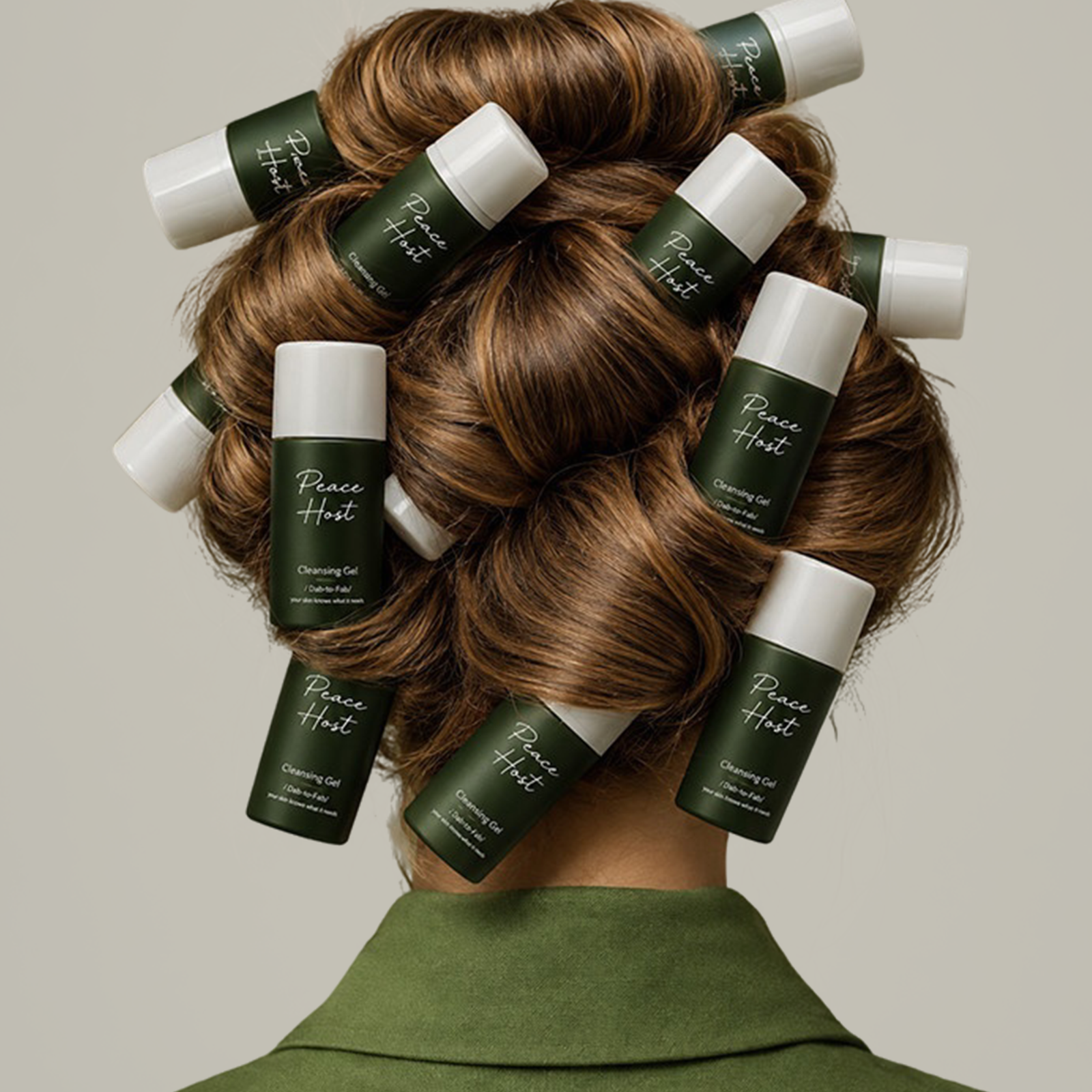
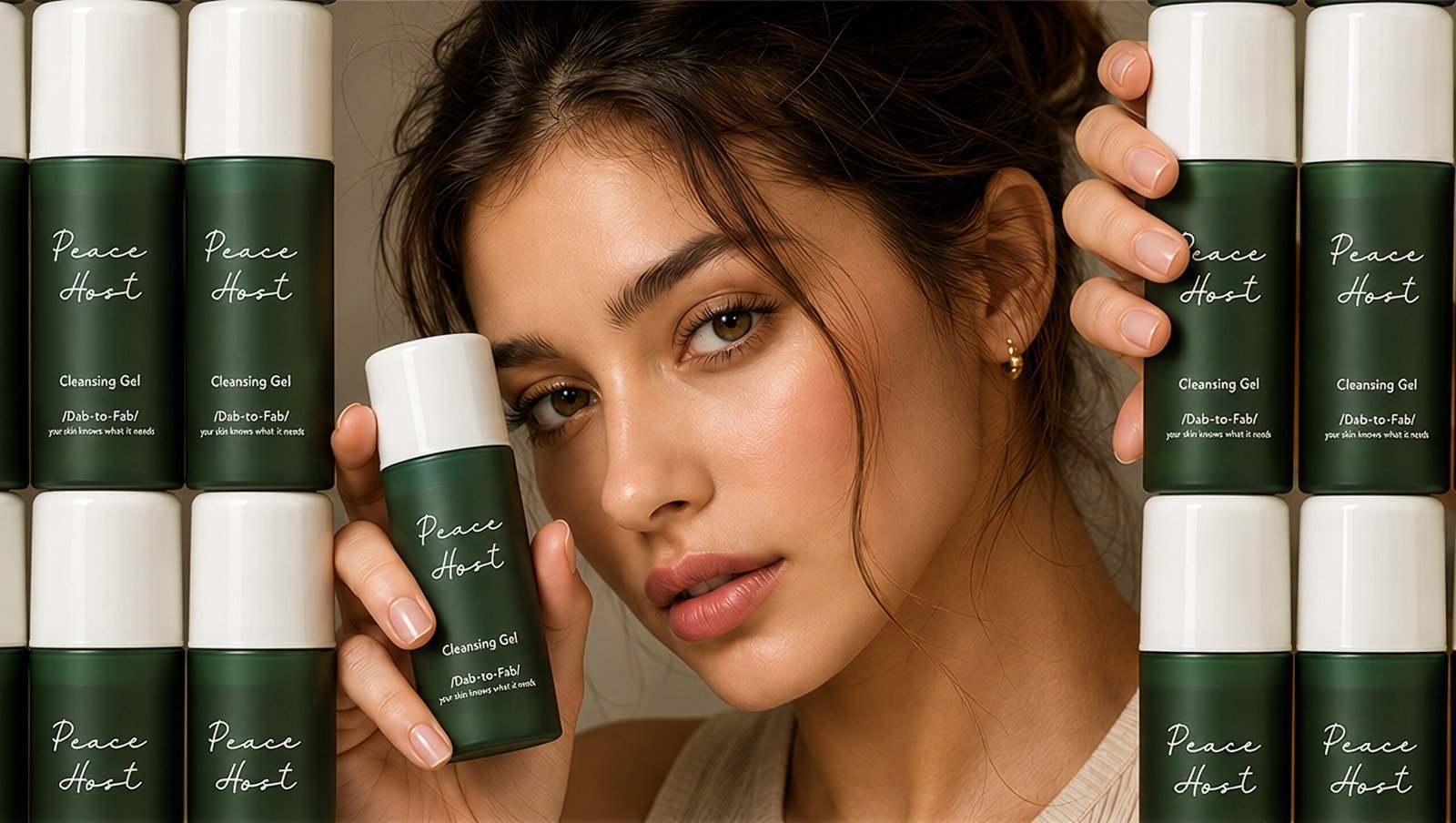
The wordmark was intentionally designed to feel like a word pulled straight from a dictionary, making the name itself a visual statement. The recurring arch became a key graphic element within the identity, creating a recognisable language that could extend across different touchpoints. This was carried through the packaging, website, catalogues and PR experience using earthy colour blocking, clean layouts and the signature arch. The result is a cohesive skincare identity that feels confident, contemporary and approachable.